Flexbox
One-axis container layout with grow/shrink/basis
Overview
display: flex lays out children along one axis and aligns them on the other.
The axis is set by flex-direction; the rest of the properties decide how
remaining space is distributed and where items align.
<div style='display: flex; gap: 8px; padding: 8px;'>
   <div>one</div>
   <div>two</div>
   <div>three</div>
 </div>
Container properties
These apply to the element with display: flex (or inline-flex).
flex-direction
row(default). Main axis is horizontal. Items run first to last.row-reverse. Main axis is horizontal. Items run last to first.column. Main axis is vertical. Items run first to last.column-reverse. Main axis is vertical. Items run last to first.
row makes the inline axis the main axis. column makes the block axis
the main axis.
flex-wrap
nowrap(default). Single line. Items shrink to fit.wrap. Overflow wraps to a new line.wrap-reverse. Wraps in reverse cross-axis order.
<div style='display: flex; flex-wrap: wrap; gap: 8px;'>
   <div style='width: 120px;'>one</div>
   <div style='width: 120px;'>two</div>
   <div style='width: 120px;'>three</div>
 </div>
justify-content: main-axis alignment
justify-content distributes free space along the main axis:
flex-start/start(default). Free space at the end.flex-end/end. Free space at the start.center. Free space split equally on both ends.space-between. Space between items, none at ends.space-around. Half-space at ends, full between.space-evenly. Equal space everywhere.
The CSS-Box-Alignment names (start, end) and the legacy flex names
(flex-start, flex-end) produce the same layout.
align-items: cross-axis alignment for every line
stretch(default). Fills the cross axis.start/flex-start. Aligns to cross-start.end/flex-end. Aligns to cross-end.center. Centres on cross axis.baseline. Aligns text baselines.
align-content: cross-axis alignment between lines
Only takes effect when flex-wrap: wrap produces multiple lines.
align-content accepts the same set as align-items plus
space-between and space-around.
gap, row-gap, column-gap
Adds space between items without margins. In flex-direction: row, column-gap
is the main-axis gap and row-gap is the cross-axis gap (between wrapped lines).
<div style='display: flex; flex-wrap: wrap; row-gap: 12px; column-gap: 8px;'>
   ...
 </div>
Item properties
These apply to children of a flex container.
flex-grow and flex-shrink
flex-grow is a non-negative number, default 0. flex-shrink is its
mirror, default 1.
When the container has free space on the main axis, items split it in
proportion to flex-grow. When the container is overflowing, items
shrink in proportion to flex-shrink.
<div style='display: flex;'>
   <div style='flex-grow: 1;'>fills available</div>
   <div style='flex-grow: 2;'>fills twice as much</div>
   <div>auto-sized</div>
 </div>
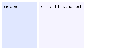
flex-grow: 0; flex-shrink: 0 pins an item to its flex-basis size.
That's useful for sidebars and toolbars.
flex-basis
auto(default). Useswidthorheight.<length>. Fixed size before grow/shrink applies.
flex-basis is the size the item starts at before flex-grow or
flex-shrink redistribute space. auto falls back to width (in row)
or height (in column).
align-self: override align-items for one item
align-self accepts:
auto(default). Inherits the container'salign-items.stretch,start,end,center,baseline.
<div style='display: flex; align-items: stretch;'>
   <div>stretches</div>
   <div style='align-self: center;'>centred only</div>
 </div>
Recipes
Sidebar + content
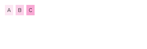
Equal columns
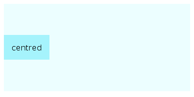
Centred content
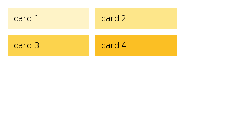
Wrapping cards
Default values at a glance
flex-directiondefaults torow.flex-wrapdefaults tonowrap.justify-contentdefaults tostart.align-itemsdefaults tostretch.align-contentdefaults tostretch.flex-growdefaults to0.flex-shrinkdefaults to1.flex-basisdefaults toauto.align-selfdefaults toauto.gapdefaults to0.
Coming Up Next
- Grid — Two-axis container layout with tracks and areas
- Simple Layout — Explains block formatting, sizing, positioning, the box model and how to handle overflowing content
- Inline Layout — Text flow, word breaks, writing modes, multi-column