Grid
Two-axis container layout with tracks and areas
Overview
display: grid lays out children on a two-dimensional grid of explicit columns
and rows. Tracks (grid-template-columns / grid-template-rows) decide where
the lines go; placement properties (grid-column, grid-row) decide which
cells each child occupies.
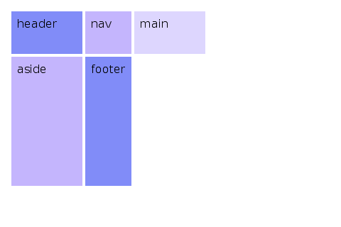
<div style='display: grid;
            grid-template-columns: 200px 1fr 200px;
            grid-template-rows: auto 1fr auto;
            gap: 12px;
            height: 400px;'>
   <header style='grid-column: 1 / 4;'>header</header>
   <nav>nav</nav>
   <main>main</main>
   <aside>aside</aside>
   <footer style='grid-column: 1 / 4;'>footer</footer>
 </div>
Track sizing
grid-template-columns and grid-template-rows accept a space-separated
list of track sizes:
<length>(100px,2em,30%). Fixed size.Nfr(1fr,0.5fr,2.5fr). Fraction of remaining space. Fractional values are supported.auto. Sizes from content.min-content. Smallest size that doesn't overflow content.max-content. Sized to fit unwrapped content.minmax(<min>, <max>). Clamps the track to a range.fit-content(<length>). Equivalent tomin(max-content, max(min-content, <length>)).
<div style='display: grid;
            grid-template-columns: 100px 1fr minmax(200px, 2fr) auto;'>
   ...
 </div>
repeat()
repeat(N, <track-list>) expands inline. The track list may contain
multiple tracks, which all repeat together:
repeat(3, 1fr)expands to1fr 1fr 1fr.repeat(2, 100px 1fr)expands to100px 1fr 100px 1fr.100px repeat(2, 1fr) autoexpands to100px 1fr 1fr auto.
The repeat count is capped at 10,000 to prevent runaway expansion.
grid-template-areas
Names regions of the grid using quoted row strings. Each cell is a token; .
means „no area“.
<div style='display: grid;
            grid-template-columns: 200px 1fr 200px;
            grid-template-rows: 80px 1fr 60px;
            grid-template-areas:
              "header header header"
              "nav    main   aside"
              "footer footer footer";
            gap: 8px;'>
   <header style='grid-area: header;'>...</header>
   <nav    style='grid-area: nav;'>...</nav>
   <main   style='grid-area: main;'>...</main>
   <aside  style='grid-area: aside;'>...</aside>
   <footer style='grid-area: footer;'>...</footer>
 </div>
Every row string must have the same number of cells, and a named area must form a rectangle.
Item placement: grid-column / grid-row
grid-column and grid-row take <start> / <end>:
auto. Auto-place.2. Start at line 2, span 1 cell.2 / 4. From line 2 up to (not including) line 4.2 / span 3. Start at line 2, span 3 tracks.span 2. Span 2 tracks, position auto.header / footer. Named lines.-1. Last line, counts from the end.
<div style='grid-column: 1 / -1;'>full-width header</div>
<div style='grid-row: 2; grid-column: 2 / span 2;'>main content</div>
grid-area: <name> is the shorthand when you've defined grid-template-areas.
Auto-placement
Children without explicit placement flow into the next free cell.
grid-auto-flow controls the direction:
row(default). Fill rows left-to-right.column. Fill columns top-to-bottom.row dense. Backfill earlier holes.column dense. Backfill earlier holes, column-first.
grid-auto-rows and grid-auto-columns size implicitly-created tracks.
For example, if you've defined three columns but place a child on column
5, columns 4 and 5 are sized by grid-auto-columns.
gap, row-gap, column-gap
gap: <row> <column>. The longhands take a single <length>. Same as
flexbox.
<div style='display: grid; grid-template-columns: 1fr 1fr 1fr; gap: 16px 8px;'>
   ...
 </div>
Alignment
Grid uses two pairs of axes (rows by columns) and reuses the flex names:
- Row (cross) axis. Container uses
align-items. Items override withalign-self. - Column (main) axis. Container uses
justify-items. Items override withjustify-self. - Line spacing within tracks (cross). Container uses
align-content. No item override. - Line spacing within tracks (main). Container uses
justify-content. No item override.
justify-items accepts stretch (default), start, end, center.
justify-self accepts auto (default, inherits justify-items),
stretch, start, end, center.
Recipes
Holy grail layout
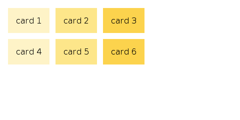
Card grid
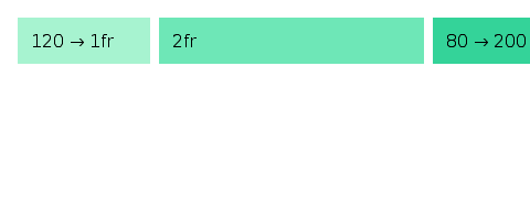
Responsive minmax
Default values at a glance
grid-template-columnsdefaults tonone.grid-template-rowsdefaults tonone.grid-template-areasdefaults tonone.grid-auto-flowdefaults torow.grid-auto-columnsdefaults toauto.grid-auto-rowsdefaults toauto.grid-columnandgrid-rowdefault toauto / auto.justify-itemsdefaults tostretch.justify-selfdefaults toauto.align-itemsdefaults tostretch.align-selfdefaults toauto.gapdefaults to0.
Coming Up Next
- Events — Callbacks, event filters, and how state triggers relayout
- Images — Loading raster images and CSS backgrounds
- Flexbox — One-axis container layout with grow/shrink/basis
- Text Input — Editable text, IME, and the selection model