Inline Layout
Text flow, word breaks, writing modes, multi-column
Overview
Inline content flows from left to right (or right to left, in RTL scripts) inside a block. The browser-style line box wraps when it runs out of room and pushes the next chunk down. Block elements stack vertically; inline elements stack horizontally and wrap.
display: inline participates in line layout. It gets no explicit width
or height, paints between text runs, and breaks across lines if it has to.
display: inline-block does accept width and height (and so behaves
like a small block), but otherwise still rides along inline content.
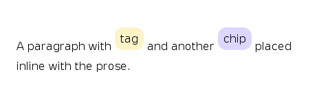
<p>
  Inline:
  <span style='display: inline; background: #fef3c7;'>span</span> wraps with text.
  Inline-block:
  <span style='display: inline-block; width: 80px; background: #c4b5fd;'>fixed-width</span>
  is sized like a block but flows inline.
</p>
Choosing between inline and inline-block
inline. Doesn't acceptwidth/height. Breaks across lines. Use for text emphasis, anchors, icons inside prose.inline-block. Acceptswidth/height. Doesn't break across lines. Use for tags, chips, fixed-size inline buttons.
inline-flex and inline-grid are flex and grid containers that
participate inline. Their content lays out as flex or grid, but the box
itself rides the surrounding line.
How text becomes lines
You don't drive text layout directly. Set CSS properties on the container. The engine shapes glyphs, picks line breaks, reorders bidirectional runs, and positions output at layout time. For the architecture, see Inline Layout and Text Shaping.
Wrapping: white-space, word-break, overflow-wrap
white-space controls whitespace collapsing and wrapping:
normal(default). Collapses whitespace. Wraps.pre. Preserves whitespace. No wrapping except at explicit breaks.nowrap. Collapses whitespace. No wrapping.pre-wrap. Preserves whitespace. Wraps.pre-line. Collapses whitespace but preserves newlines. Wraps.break-spaces. Preserves whitespace. Breaks at every space.
word-break decides what to do with sequences that have no soft breaks
(URLs, code, CJK):
normal(default).break-all. Allows break between any two characters.keep-all. Forbids break inside CJK.break-word. Deprecated alias.
overflow-wrap accepts normal (only at allowed break points),
anywhere (break anywhere to prevent overflow), and break-word.
hyphens: none | manual | auto enables soft-hyphen breaking. auto
requires the layout crate's hyphenation resources for the active
language.
.code { white-space: pre; tab-size: 4em; }
.tag  { white-space: nowrap; }
.body { hyphens: auto; word-break: normal; overflow-wrap: anywhere; }
Spacing and metrics
The properties that modulate inline flow:
line-height.<percentage>or<length>. Default120%. Baseline-to-baseline distance.letter-spacing.<length>. Default0px. Added between every glyph.word-spacing.<length>. Default0px. Added between words.tab-size.<length>. Default8em. Width of a tab character.vertical-align. Defaultbaseline. How inline-blocks line up against the line box.
.body { line-height: 150%; letter-spacing: 0.02em; }
pre   { tab-size: 4em; }
vertical-align accepts baseline, top, middle, bottom, sub,
super, text-top, text-bottom, a <percentage>, or a <length>.
The line box is sized by the tallest inline-block on the line, so mixing
vertical-align: top and vertical-align: middle produces the same line
height. Only the glyph placement within that line changes.
Direction and writing modes
For bidirectional text, set direction on the block container:
ltr(default). Left-to-right.rtl. Right-to-left.
unicode-bidi sets the bidi-override embedding for an inline element.
Most apps don't touch it. The bidi pass handles mixed text correctly
without help.
writing-mode swaps the block and inline axes. Inline text then flows
down (or up) instead of across:
horizontal-tb(default). Latin scripts.vertical-rl. CJK vertical.vertical-lr. Mongolian.
Properties that follow the inline axis (padding-inline-start,
padding-inline-end, margin-inline-*, gap's row/column meaning)
re-orient when the writing mode is vertical.
<div style='writing-mode: vertical-rl; height: 200px;'>
  Vertical CJK-style flow, top-to-bottom right-to-left.
</div>
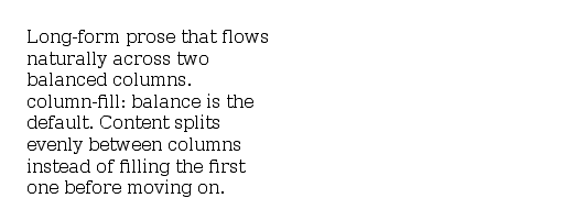
Multi-column
column-count, column-width, and the column-rule-* longhands flow
block content into multiple columns:
article { column-count: 2; column-gap: 24px; column-rule: 1px solid #ccc; }
column-count. Integer orauto.column-width.<length>orauto.column-gap.<length>.column-rule. Shorthand forwidth style color.column-span.noneorall(span every column).column-fill.balance(default, even split) orauto(fill columns one by one).
Pagination and fragmentation
For print and paginated views, fragmentation properties decide where breaks may occur:
page-break-before/page-break-after.auto,always,avoid,left,right.break-inside.auto,avoid,avoid-page,avoid-column.widows,orphans. Minimum lines kept together.box-decoration-break.sliceorclone.
These have no visible effect inside a window. They fire when the layout is rendered to PDF.
Floats and clear
clear: left | right | both | none interacts only with floats. It's
honoured on block elements next to float siblings. Floats are rare in
modern UI code. Flexbox and grid handle the same problems with fewer
surprises.
Recipes
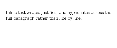
Wrapping prose
Inline tags / chips
Two-column article
Default values at a glance
displaydefaults toblock. Override toinlineorinline-blockper element.white-spacedefaults tonormal.word-breakdefaults tonormal.overflow-wrapdefaults tonormal.hyphensdefaults tomanual.directiondefaults toltr.writing-modedefaults tohorizontal-tb.line-heightdefaults to120%.letter-spacingdefaults to0px.word-spacingdefaults to0px.tab-sizedefaults to8em.vertical-aligndefaults tobaseline.column-countdefaults toauto.column-filldefaults tobalance.column-ruledefaults tomedium none currentColor.widowsandorphansdefault to2.
Coming Up Next
- Flexbox — One-axis container layout with grow/shrink/basis
- Grid — Two-axis container layout with tracks and areas
- Styling Text — Font family, size, weight, alignment, decoration, and the system font keywords
- Text Input — Editable text, IME, and the selection model