Simple Layout
Explains block formatting, sizing, positioning, the box model and how to handle overflowing content
Overview
Every element in a Dom starts at display: block. A block element takes
the full width of its parent, stacks below the previous sibling, and is
sized by the box-model properties (width, height, padding, border,
margin). Block layout runs by default. Flexbox and grid are opt-in.
display: block and inline-block
The display property:
block(default). Full-width box. Stacks vertically with siblings.inline-block. Flows with text but acceptswidthandheight.flex. One-axis container. See Flexbox.grid. Two-axis container. See Grid.none. Removes from layout. The element stays in the DOM.
inline (without -block) is covered on
Inline and inline-block. The table values (table,
table-row, table-cell, list-item, flow-root) are honoured but rare
in app code.
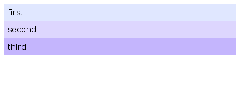
<div style='display: block; padding: 16px; background: #e0e7ff;'>first</div>
<div style='display: block; padding: 16px; background: #ddd6fe;'>second</div>
Sizing: width, height, and min- / max- constraints
width and height accept:
auto. The default. Sizes from content (block) or stretches to container.<length>. Pixels (px), points (pt), em (em), root em (rem), viewport (vw/vh), or<percentage>.min-content,max-content,fit-content(<length>). Content-driven.calc(<expr>). Arithmetic over the above. Seecalc()below.
min-width, min-height, max-width, and max-height take a single
pixel value. Defaults: min-* is 0px, max-* is unconstrained.
.card { width: 320px; min-height: 100px; max-width: 100%; }
.fluid { width: calc(50% - 20px); }
box-sizing
content-box(default).widthandheightapply to content only.border-box.widthandheightinclude padding and border.
box-sizing: border-box is what you usually want for forms and grids.
The content-box default matches the original CSS 1 behaviour.
calc()
.sidebar { width: calc(33.333% - 10px); }
.gutter  { width: calc((100% - 40px) / 3); }
Operators: +, -, *, /. Negative numeric literals are recognised
when they follow an operator or (. Otherwise - is a subtraction
operator.
margin and padding
Padding insets the content within the box; margin separates the box from its siblings:
.card { padding: 12px 16px; margin: 0 auto; }
.tight { padding-top: 4px; padding-inline-start: 8px; }
The shorthand expands the standard CSS way. One value sets all four
sides. Two values set vertical and horizontal. Three values set top,
horizontal, bottom. Four values set top, right, bottom, left.
padding-inline-start and padding-inline-end follow writing-mode and
direction.
Margins on position: static block elements collapse vertically the way
CSS specifies. Margins inside display: flex and display: grid
containers do not collapse. Use gap instead.
position
The position property:
static(default). Normal flow. Offsets are ignored.relative. Normal flow, then shifted bytop,right,bottom,left.absolute. Offsets, relative to the nearest positioned ancestor.fixed. Offsets, relative to the window.sticky. Flow until offsets would be violated, then pinned to the scroll container.
„Positioned ancestor“ means any ancestor whose position is not static.
<div style='position: relative;'>
   <div style='position: absolute; top: 8px; right: 8px;'>badge</div>
   container content
 </div>
Offsets: top, right, bottom, left
Each offset is a <length> or <percentage>. auto (the default) means
„no constraint“ and lets the solver compute it.
<length>is a fixed pixel distance.<percentage>resolves against the containing block's width (left/right) or height (top/bottom).
For position: absolute:
- Setting
topandbottomstretches the element vertically. - Setting
leftandrightstretches it horizontally. - Combined with
width: auto/height: auto, this fills a positioned ancestor exactly.
<div style='position: relative; height: 200px;'>
   <div style='position: absolute; top: 0; bottom: 0; right: 0; width: 60px;'>
     full-height sidebar
   </div>
 </div>
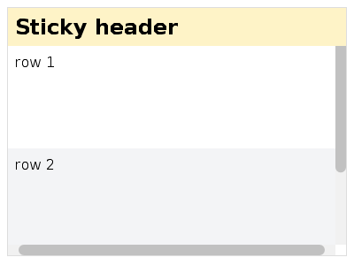
position: sticky
A sticky element behaves like relative until the user scrolls past the
offsets, at which point it pins to the scroll container's edge:
<div style='overflow: auto; height: 300px;'>
   <h2 style='position: sticky; top: 0; background: white;'>section A</h2>
   <p>...long content...</p>
   <h2 style='position: sticky; top: 0; background: white;'>section B</h2>
   <p>...long content...</p>
 </div>
The nearest scroll container is whatever ancestor has overflow: auto | scroll | hidden | clip. If the document body is the scroll container, the
sticky element pins to the window.
z-index
z-index accepts:
auto(default). Same stacking level as parent.<integer>. Explicit stacking order. Positive values stack above, negative below.
z-index only takes effect on positioned elements (position is not
static). A positioned element with z-index: <integer> creates a new
stacking context. Its descendants then stack relative to it, not the
document root.
overflow
overflow controls clipping and scrolling. Apply overflow-x and
overflow-y independently, or set both with the shorthand overflow.
visible(default). No clip, no scroll.hidden. Clips. Programmatic scrolling only. No scrollbar.clip. Clips. No scrolling.scroll. Clips and scrolls. Scrollbar always shown.auto. Clips and scrolls. Scrollbar shown when content overflows.
clip vs hidden
clip is a stricter form of hidden:
- Both clip overflowing content.
hiddenpermits programmatic scrolling.clipdoes not.clipmakes the element a „non-scroll container“.overflow-clip-marginextends the clip region outside the box. It has no effect onhidden.
Computed-value coupling
CSS Overflow 3 § 3.1 specifies that visible or clip on one axis
becomes auto or hidden if the other axis is scrollable:
overflow-x: visible, overflow-y: scroll  →  computed: auto / scroll
overflow-x: clip,    overflow-y: hidden  →  computed: hidden / hidden
overflow-x: visible, overflow-y: visible →  unchanged
scrollbar-gutter
scrollbar-gutter reserves space for the scrollbar so layout doesn't
shift when content starts overflowing.
auto(default). Gutter only when the scrollbar is shown.stable. Gutter always reserved on the scrollbar's edge.stable both-edges. Gutter on both edges for visual symmetry.
.pane { overflow-y: auto; scrollbar-gutter: stable; }
overflow-clip-margin
overflow-clip-margin extends the clip region outside the box. It only
applies when overflow: clip is set.
Syntax: <visual-box> || <length>. The box defaults to padding-box. The
length defaults to 0px.
.badge { overflow: clip; overflow-clip-margin: padding-box 4px; }
The legacy clip: rect(...) property
clip: rect(...) is the deprecated CSS 2.1 property used with
position: absolute. Each edge is either auto (the corresponding box
edge) or a <length>:
.overlay { position: absolute; clip: rect(0, 100px, 50px, 0); }
Prefer clip-path for new code.
gap, row-gap, column-gap
gap adds space between flex and grid items without a margin on each
child:
.grid { display: grid; grid-template-columns: 1fr 1fr 1fr; gap: 16px; }
.row  { display: flex; column-gap: 8px; row-gap: 4px; }
The shorthand gap: <row> <column> and the longhands row-gap and
column-gap all take a single <length>. gap does nothing on plain
block children. It's flex and grid only.
Recipes
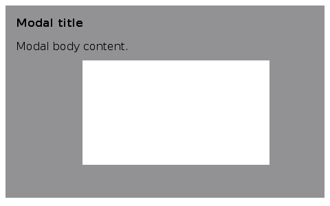
Modal overlay
Pinned header
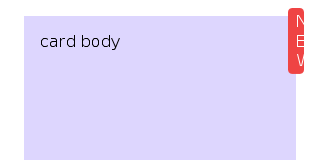
Layered badge
Default block flow
Default values at a glance
displaydefaults toblock.widthandheightdefault toauto.box-sizingdefaults tocontent-box.min-widthandmin-heightdefault to0px.max-widthandmax-heightdefault to unconstrained.margin-*andpadding-*default to0px.positiondefaults tostatic.top,right,bottom, andleftdefault toauto.z-indexdefaults toauto.overflow-xandoverflow-ydefault tovisible.scrollbar-gutterdefaults toauto.overflow-clip-margindefaults topadding-box 0px.
Coming Up Next
- Inline Layout — Text flow, word breaks, writing modes, multi-column
- Flexbox — One-axis container layout with grow/shrink/basis
- Grid — Two-axis container layout with tracks and areas
- Scrolling — Scroll containers, drag-and-drop, hit testing