System Themes
System colors, `@theme`, `@os`, and accessibility queries
Overview
WIP. Discovery (theme, accent, fonts, accessibility) is wired up across all desktop platforms. The user-facing CSS hooks (system:* colors, system:* fonts, @theme dark) work today. Some discovered values still arrive via CLI wrappers; the FFI-direct paths and ricing overrides are still being stabilized.
A native-feeling app reads its colors and fonts from the host OS. Azul exposes those values through three CSS hooks:
system:<color>for colors that follow the user's accent and theme.system:<font>for the platform's UI, monospace, or serif fonts.@theme dark { ... }and@os <name>for conditional rules that re-evaluate per frame when the user toggles dark mode or moves to a different desktop environment.
background: system:window-background;
color: system:text;
font-family: system:ui;
border: 1px solid system:accent;
@theme dark {
    background: #1c1c1e;
    color: #f0f0f0;
}
Use a system:<name> keyword wherever a color is accepted. The framework
resolves it at frame time using the user's current settings:
system:text. Primary text color.system:background. Content background.system:accent. The user's accent color (Windows, macOS, GNOME).system:accent-text. Readable text on an accent fill.system:button-face. Button or control background.system:button-text. Button or control text.system:window-background. Window chrome background.system:selection-background. Selected-text background.system:selection-text. Selected-text foreground.
The resolver picks the user's current value if the OS reported one, and
falls back to a standard color otherwise. The full collection (link,
separator, grid, sidebar, and inactive-window variants) is on
SystemColors.
use azul::prelude::*;
let _ = Dom::create_button("Save", SmallAriaInfo::label("Save")).with_css("
    background: system:button-face;
    color: system:button-text;
    border: 1px solid system:accent;
    padding: 6px 14px;
    :hover { background: system:accent; color: system:accent-text; }
");
System fonts
system:<role> keywords pick the right face on each platform.
SystemFontType enumerates the roles:
system:ui. macOS: SF Pro Text. Windows: Segoe UI Variable. Linux: Cantarell.system:ui:bold. macOS: SF Pro Text Bold. Windows: Segoe UI Bold. Linux: Cantarell Bold.system:monospace. macOS: SF Mono or Menlo. Windows: Cascadia Mono or Consolas. Linux: Ubuntu Mono or DejaVu Sans Mono.system:monospace:bold. macOS: Menlo Bold. Windows: Cascadia Mono Bold. Linux: Ubuntu Mono Bold.system:monospace:italic. macOS: Menlo Italic. Windows: Cascadia Mono Italic. Linux: Ubuntu Mono Italic.system:title. macOS: SF Pro Display. Windows: Segoe UI Variable Display. Linux: Cantarell.system:title:bold. macOS: SF Pro Display Bold. Windows: Segoe UI Variable Display Bold. Linux: Cantarell Bold.system:menu. macOS: SF Pro Text. Windows: Segoe UI. Linux: Cantarell.system:small. macOS: SF Pro Text 11pt. Windows: Segoe UI 9pt. Linux: Cantarell 9pt.system:serif. macOS: New York. Windows: Cambria. Linux: DejaVu Serif.system:serif:bold. macOS: Georgia Bold. Windows: Cambria Bold. Linux: DejaVu Serif Bold.
The framework walks a fallback chain at font resolution and falls through
to the sans-serif, monospace, or serif generics if none match.
font-family: system:ui;
font-size: 14px;
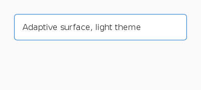
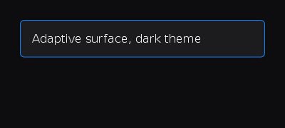
@theme adaptation
@theme <variant> { ... } blocks evaluate per frame. The variant matches
the system's current preference (light or dark) and updates the moment the
user toggles their OS-wide setting (no DOM rebuild required):
background: white;
color: #1a1a1a;
@theme dark {
    background: #1c1c1e;
    color: #f0f0f0;
}
@theme custom-high-contrast {
    background: black;
    color: yellow;
}
The variants follow ThemeCondition:
@theme light: system reports light theme.@theme dark: system reports dark theme.@theme <name>: a custom string treated as user-defined. The system resolver doesn't emit it on its own.
For typical apps, define the base style for light mode and override
selected properties under @theme dark. Combine with @os for
platform-flavoured dark mode (a Mac-style sheen vs. a Windows-style flat
fill).
@os
A single rule covers OS family, version, and Linux desktop environment.
The grammar is @os(<family>[:<de>] [<op> <version>]). Each clause is
optional; op is >=, <=, or =.
OS families:
windows. Windows desktop.macos. macOS.ios. iOS.apple. macOS or iOS.linux. Any Linux desktop.android. Android.web. WASM target.any. Always matches.
Family-only rules also accept the bare-identifier form: @os linux { … }
is the same as @os(linux) { … }.
/* family only */
@os(linux)               { font-family: 'Cantarell'; }
@os(windows)             { font-family: 'Segoe UI'; }

/* family + version — codename or bare number both work */
@os(windows >= 11)       { font-family: 'Segoe UI Variable Text'; }
@os(macos >= big-sur)    { font-family: '.SF NS'; }
@os(linux >= 6)          { /* kernel 6.0+ */ }

/* Linux desktop environment */
@os(linux:gnome)         { font-family: 'Cantarell'; }
@os(linux:kde)           { font-family: 'Noto Sans'; }

/* family + DE + DE version */
@os(linux:gnome > 40)    { padding-inline-start: 16px; }
Comparisons across OS families always evaluate to false.
@os(macos >= sonoma) on Windows is just inert, not a parse error.
Desktop-environment versions only match when the runtime knows the DE's
version number; until detection is wired up for a given DE, the
@os(linux:de > N) form will not match.
Version synonyms are accepted permissively: bare numbers (11),
prefixed forms (win-11, win11, windows-11), and codenames where
they exist (big-sur, monterey, sonoma) all map to the same
underlying version. Linux accepts 5, 5.4, and 5.4.10.
Accessibility queries
These map to the OS's accessibility settings. They live on
AccessibilitySettings and re-evaluate per frame.
transition: background 200ms ease;
@media (prefers-reduced-motion) {
    transition: none;
}
@media (prefers-contrast) {
    background: black;
    color: white;
    border: 2px solid white;
}
@media (prefers-reduced-motion). Source: macOSAXReduceMotion, WindowsSPI_GETCLIENTAREAANIMATION, Linuxenable-animations.@media (prefers-contrast). Source: macOSAXIncreaseContrast, WindowsSPI_GETHIGHCONTRAST, Linuxhigh-contrast.
Honour prefers-reduced-motion for any non-essential animation.
@media viewport queries
Standard CSS:
padding: 24px;
font-size: 16px;
@media (max-width: 640px) {
    padding: 12px;
    font-size: 14px;
}
@media (orientation: portrait) {
    flex-direction: column;
}
The viewport size comes from the current window. On a multi-window app each window has its own viewport, evaluated independently.
@lang()
Match the system locale. Prefix matching: @lang(de) matches de,
de-DE, de-AT. Useful for locale-specific quotes, hyphenation, and
typographic conventions:
quotes: '\u{201C}' '\u{201D}';
@lang(de) { quotes: '\u{201E}' '\u{201C}'; }
@lang(fr) { quotes: '\u{00AB} ' ' \u{00BB}'; }
The active locale field is SystemStyle.language (BCP 47, e.g.,
"en-US").
Reading discovered values from Rust
The full snapshot is SystemStyle. Every field ends up populating the
dynamic selectors and the system:* resolver. In Rust code you generally
don't need to touch it. Stick with system:* and @theme or @os in
your CSS. Those expressions stay ergonomic and re-evaluate automatically.
How user theming layers with component CSS
The cascade has three layers, from outermost to innermost:
- System discovery (the
system:*keywords and@theme darkcondition). Resolved per frame from the running OS, so a theme toggle takes effect on the next paint without a re-layout. - End-user ricing — the optional CSS file the user dropped into
~/.config/azul/styles/<app>.css(Linux/macOS) or%APPDATA%\azul\styles\<app>.css(Windows). Loaded at app startup when theiofeature is on. - Application CSS — every component-level
Cssattached viaDom::style(...)on a subtree root, plus inline rules attached viaDom::with_css(...)on individual nodes. CSS lives on the tree the layout callback returns; there is no global stylesheet passed toApp::create.
Components don't fight user theming because their selectors target
component-internal classes (.shadcn-card, .my-row) while user
theming targets the system:* color and font hooks. As long as a
component reads its colors from system:* instead of hard-coding
hex values, the user's ~/.config/azul/styles/<app>.css can repaint
the component without the component's source changing.
A few escape hatches when the discovery isn't enough:
- Inline override on a node:
Dom::with_css_property(...)wins the cascade for that node. - Subtree override via component CSS: stack a second
CssviaDom::style(css). Later rule blocks win at equal(priority, specificity). See DOM › Component-level stylesheets.
Controlling end-user customization
Azul has a single env var for the entire end-user-customization
layer: AZ_RICING.
Unset (the default) means the framework loads the user CSS file at
~/.config/azul/styles/<app>.css if it exists, and on Linux runs the
standard detection chain (KDE > GNOME > riced-desktop > defaults).
This is the right behavior for a normal install on a normal
desktop.
AZ_RICING=off (aliases: disabled, none, 0) skips both the
user CSS file and the riced-desktop sources. Pick this for a kiosk
build, a CI runner, or any install that must not pick up local
theme customization. The cascade still runs system:* resolution
and @theme conditions — disabling ricing only stops the
user-supplied layer; the OS-supplied palette is still honored.
AZ_RICING=force (aliases: prefer, aggressive, 1) reorders the
Linux detection chain so riced-desktop sources (Hyprland config,
pywal cache, i3/sway) win over the GNOME and KDE paths. Use this
when XDG_CURRENT_DESKTOP still reports gnome but the actual
session is a tiling WM with a custom palette. The user CSS file
still loads in this mode.
There is no env var that forces dark/light mode. The platform's own
facilities (macOS General > Appearance, Windows Personalization >
Colors > Choose your mode, GNOME Settings > Appearance) drive the
prefers-color-scheme discovery and azul re-evaluates @theme on
the next frame.
Previewing on a different platform
Themes vary not just by light/dark but by OS conventions: a button on
iOS doesn't look like a button on Windows 11, and system:* colors
resolve differently on each. The main() function can override the
detected environment between AppConfig::create() and App::create(),
forcing the cascade to evaluate as if the app were running on a
different platform:
use azul::prelude::*;

fn main() {
    let mut config = AppConfig::create();

    // Pretend this app is running on iOS, dark theme, with a French
    // locale, on a 360x780 viewport. Useful for screenshot diffing,
    // designer review, or "does my app look OK on Android?" checks.
    config.mock_css_environment = OptionCssMockEnvironment::Some(
        CssMockEnvironment {
            os: OptionOsCondition::Some(OsCondition::Ios),
            theme: OptionThemeCondition::Some(ThemeCondition::Dark),
            language: OptionString::Some("fr-FR".into()),
            viewport_width: OptionF32::Some(360.0),
            viewport_height: OptionF32::Some(780.0),
            ..Default::default()
        }
    );

    // Or swap the whole SystemStyle for a curated platform preset:
    // config.system_style = SystemStyle::ios_light();

    let app = App::create(initial_data, config);
    app.run(WindowCreateOptions::new(layout));
}
Every field on CssMockEnvironment is optional — the ones not set
fall back to auto-detected values. Combined with the
SystemStyle::android_material_light(),
SystemStyle::windows_xp_luna(), and other curated presets in
css::system::defaults,
this gives a single binary the ability to render its UI as if it
were running on any supported target — useful for screenshot
testing, designer review, and „what would my app look like, pixel by
pixel, on iOS?“ sanity checks.
The override is read at app startup; it doesn't change the actual
runtime windowing backend (AZ_BACKEND does that, and that env var
isn't a theming concern — it picks x11 vs wayland etc. for the
real OS the app is actually running on). For the full list of AZ_*
runtime env vars (debug server, profiling, layout tracing, headless
rendering), see Debugging.
Coming Up Next
- Styling Text — Font family, size, weight, alignment, decoration, and the system font keywords
- Icon Packs — Register icons and use them with
Dom::create_iconor<icon> - Accessibility — Screen reader integration and ARIA roles