Layout
Overview of the layout solver
Overview
Azul lays out a Dom from its CSS-resolved styles. Every element runs
through one of four formatting modes selected by its display property:
block, inline, flex, or grid. The four sub-pages cover each mode from
simple to complex. Blocks first (the default), then inline text flow,
then the two opt-in container modes.
- Block. The default. Full-width stacked boxes. See Blocks, Sizing, and Positioning.
- Inline. Text and inline-block runs inside a block. See Inline, Inline-Block, and Text Flow.
- Flex. One-axis containers (rows or columns). See Flexbox.
- Grid. Two-axis containers (columns and rows). See Grid.
Picking a mode
Most apps use blocks for the page chrome, flex inside each block for rows and columns, and grid where you need a true 2-D layout (dashboards, image galleries, form labels with fields). Inline shows up naturally inside any block that contains text. You usually don't choose it explicitly.
# fn body() -> &'static str {
"<body>
  <header style='display: flex; gap: 16px;'>...</header>
  <main style='display: grid; grid-template-columns: 200px 1fr;'>
    <nav>...</nav>
    <article>The article body, which lays out as a block by default.</article>
  </main>
</body>"
# }
Cross-mode properties
A few properties apply regardless of the formatting mode:
width/heightand themin-/max-constraints. See Sizing.paddingandmargin. Seemarginandpadding.box-sizing. Seebox-sizing.position,z-index, andoverflow. Seepositionandoverflow.gap,row-gap,column-gap. Honoured by flex and grid. Ignored on plain block.
Block-specific details (float, clear, and display: table*) live on
the Blocks and Inline pages.
App code interacts with layout only through CSS properties and
Dom::style(...) / Dom::with_css(...).
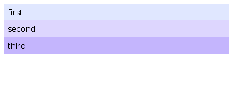
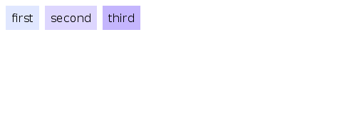
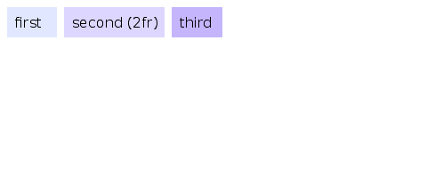
Visual examples
Same three children, three formatting modes:
Coming Up Next
- Simple Layout — Explains block formatting, sizing, positioning, the box model and how to handle overflowing content
- Inline Layout — Text flow, word breaks, writing modes, multi-column
- Flexbox — One-axis container layout with grow/shrink/basis
- Grid — Two-axis container layout with tracks and areas